Log in


renovations from the inside, out

Rogers Park Montessori is a wonderful school on the north side of Chicago. A few years back they made the leap to build their own facilities and boy, are they gorgeous! As they moved in and grew into the space, they realized they needed to update their website. Cobalt Extensions had already been helping them manage their IT and parent communications, so it was a natural step to involve us in the development of the new site. 

the logo

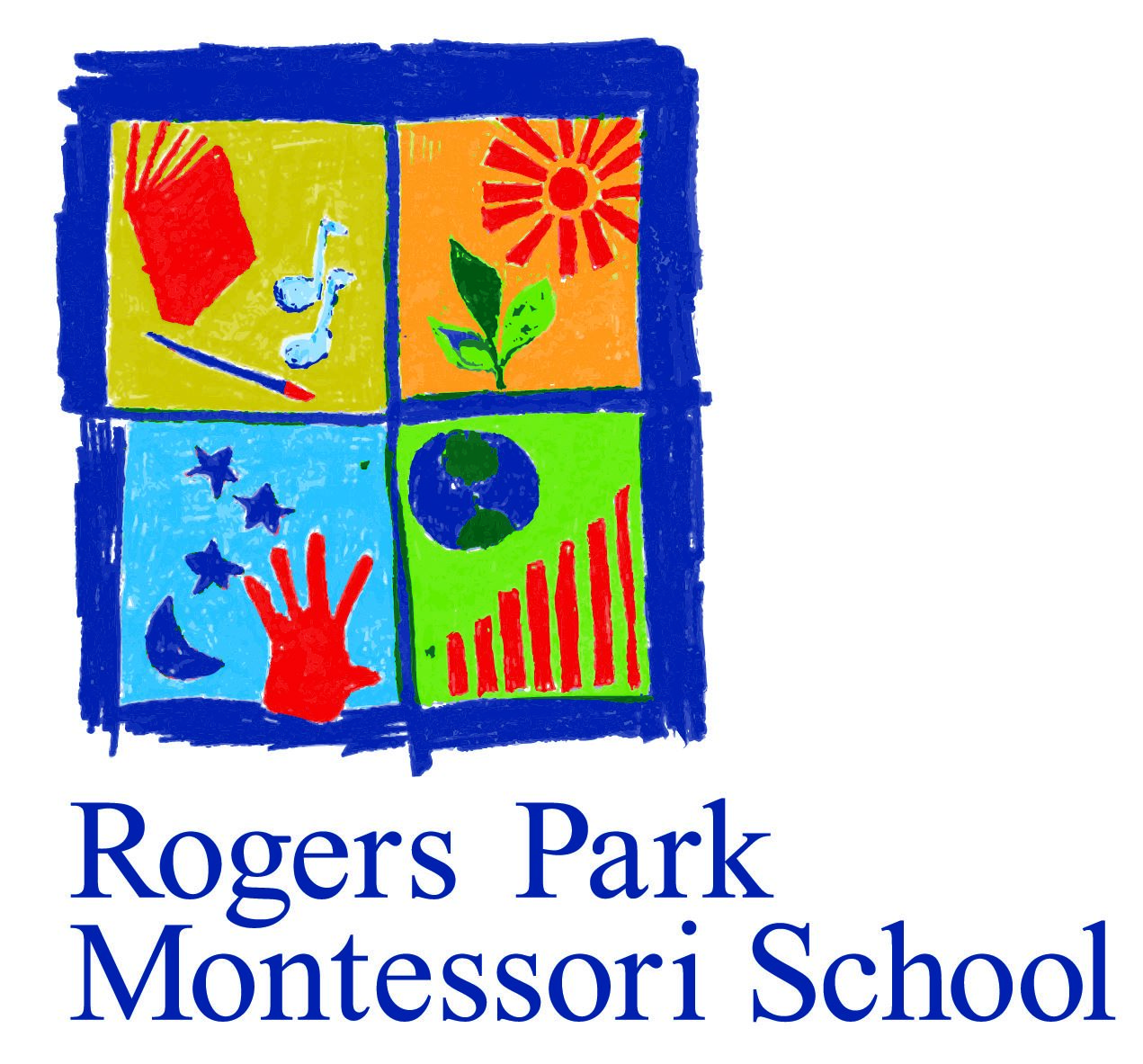
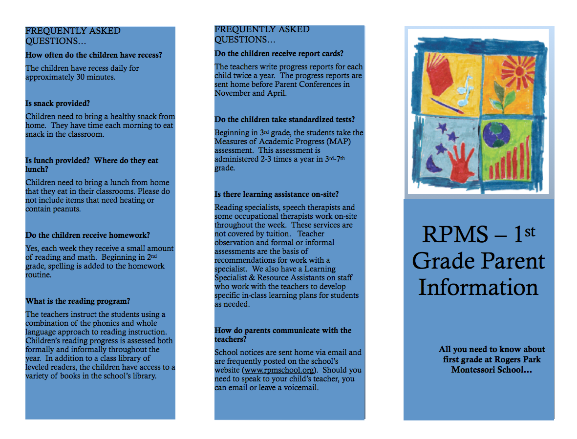
We had not set out to update Rogers Park Montessori's logo, but upon working with it, we realized it was completely disconnected from the look and feel of their new school, which is very modern and sophisticated—but still colorful. Also, the old logo had been created a long time ago, when the school only went up to the third grade. It was skewed more to the younger, primary grades and was now not something the cool middle-schoolers wanted to be associated with. We certainly didn't want to get rid of the logo, the window panes showing the different age groups are a key part of the school, but it needed to be updated to reflect its new home, and appeal a wider age group.

old


new


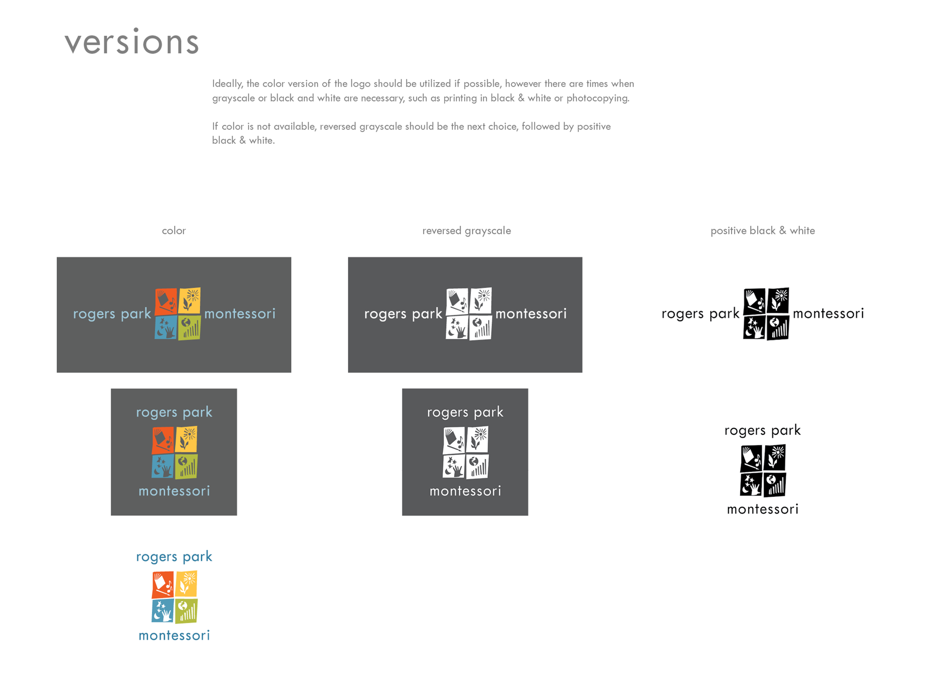
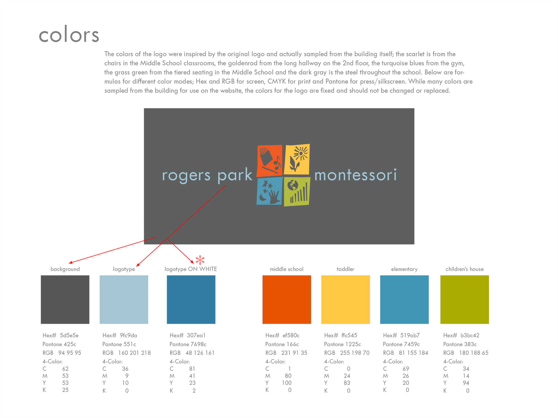
The colors in the new logo are all sampled from elements within the school, the yellow on the outside of the building, the orange in the middle school and the blues in the gym. The cool grey is a nod to the modern, and the font pays homage to Dr. Montessori's Movable Alphabet.

the website

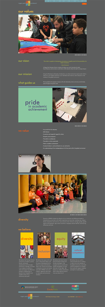
Once we had re-worked the logo, the whole website fell into place. The new logo lent itself to seamlessly organizing the various programs by utilizing the panes individually. The look is bold, friendly and bright and is the exact experience parents have when they visit the school in person. We believe this very important when we create a website, there must be a direct connection between the virtual space and the actual space.

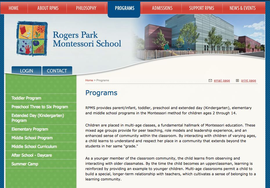
Below is a comparison between the old website and the new. In addition to a complete redesign of the website, Cobalt Extensions also provided extensive photography for use throughout the site.

old


new


branding & communication

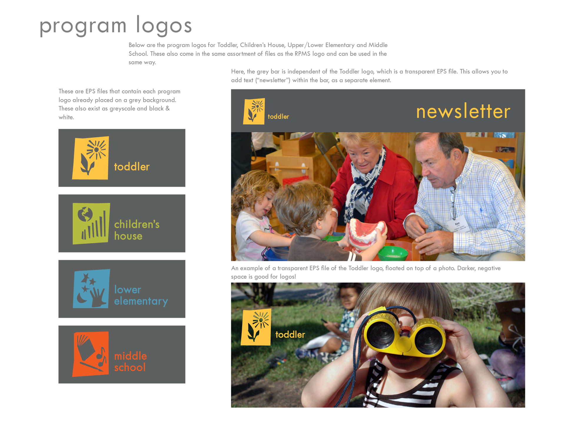
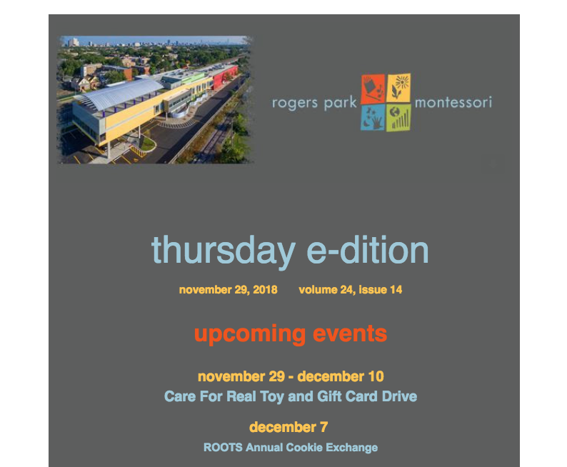
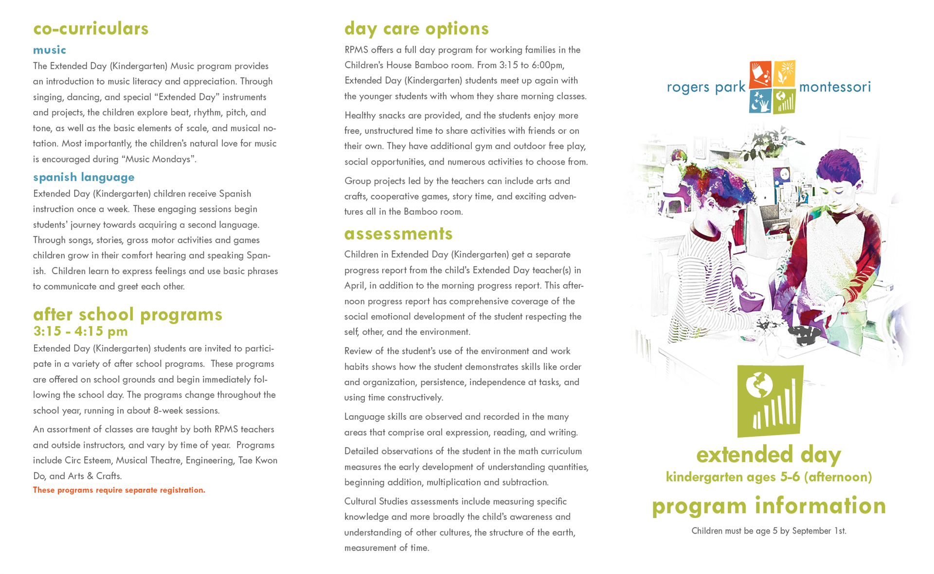
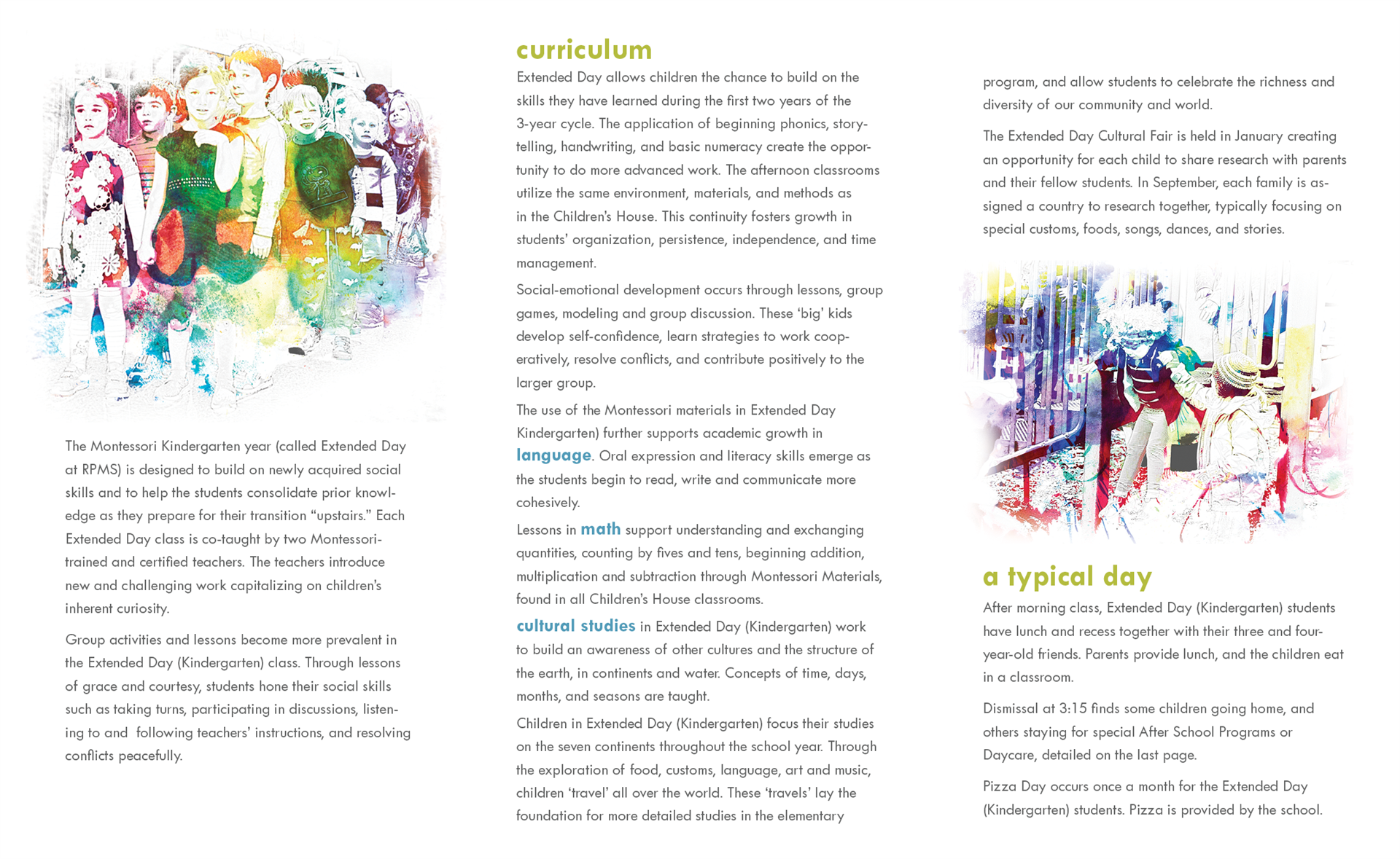
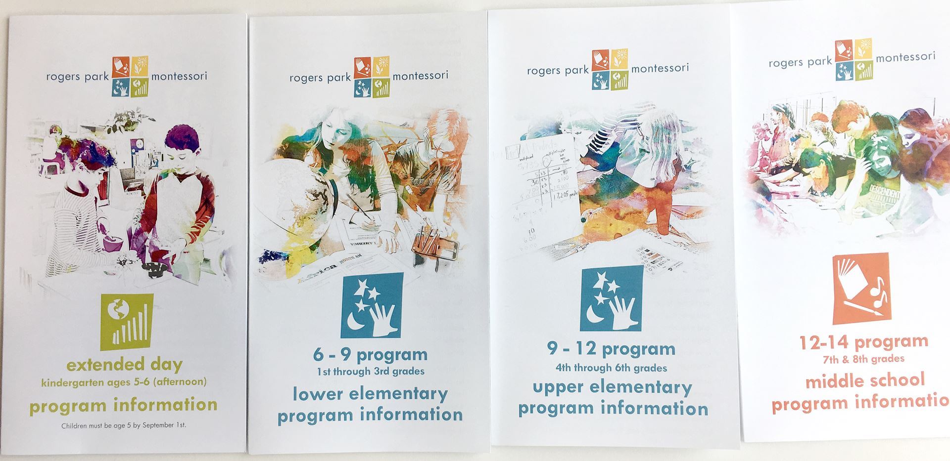
The new logo is flexible and powerful, allowing for communication across all aspects of the school's operations; from parent emails to program-specific brochures, the image of Rogers Park Montessori remains consistent.

Below are some samples from the Style Guide as well as the logo in use across the school.


old Open House brochure


new Open House brochure


We would be happy to discuss how we may be of service to you and your organization.

  +1 (847) 823-1830

   info@cobaltextensions.com