|

a whole new way to get to Knox |
|
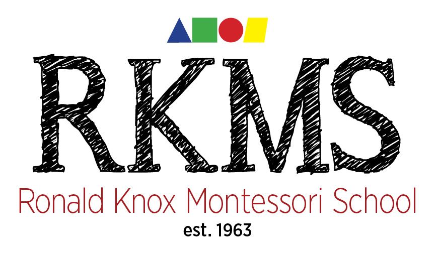
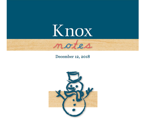
the logo |
before
Their old logo did not reflect how deeply committed the school is to providing its students with an authentic Montessori experience. Missing was a reflection of the stature and experience Ronald Knox Montessori has as a very well-reagrded school in the community. | after
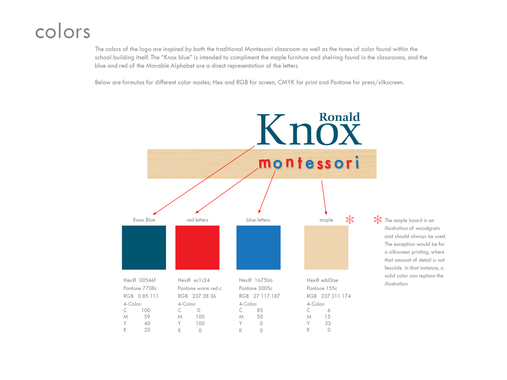
The new logo was inspired by both the setting and architecture of the school, as well as the bright maple-shelved classrooms, filled with beautiful Montessori materials. |
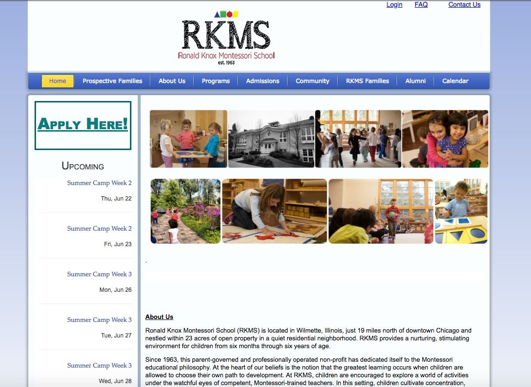
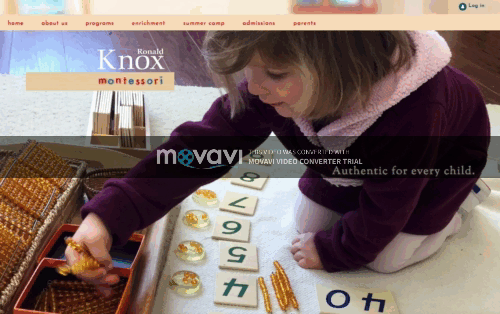
the website A school website is the first place parents go when they want to get to know a school. We feel it is imperative that the website match the actual experience of being in the physical place of the school. The atmosphere and character of the school must be captured and conveyed, otherwise it is a disconnect and possible disappointment when prospective parents come for a visit. It is also important to remember that prospective parents will often have multiple tabs open on their computers, jumping back and forth to make comparisons; this is a schools first opportunity to stand out and make a good impression. |
before
The old website utilized a dated template and in no way did it reflected the bright, happy atmosphere of the beautiful school. It was unresponsive and cumbersome to navigate, a potential hazard to attracting young, new families. | after
The new website is modern and responsive in its execution, but also captures the nature of the school and what it feels like to actually be there. |
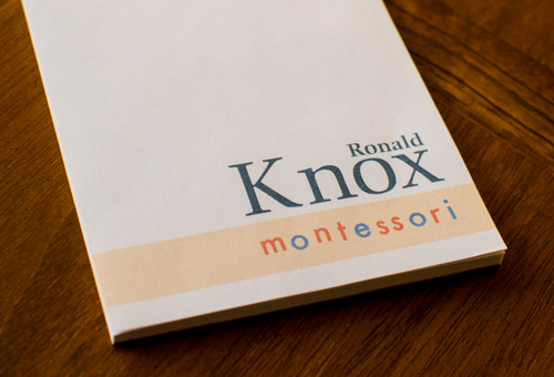
branding Branding is more than just swapping out a logo on letterhead and email signatures. The brand or image of the school is alive and is reflected in everything that its community sees and hears, that includes everything from bumper stickers and t-shirts to parent communications and the colors on the walls. We worked together to find ways to easily integrate the new image into all the elements that make up the school. Our partnership is such that we have been retained to work with the school to maintain the integrity of their branding throughout all their communications efforts. Below are a few examples of Ronald Knox's transformation. |
|  |
|
|
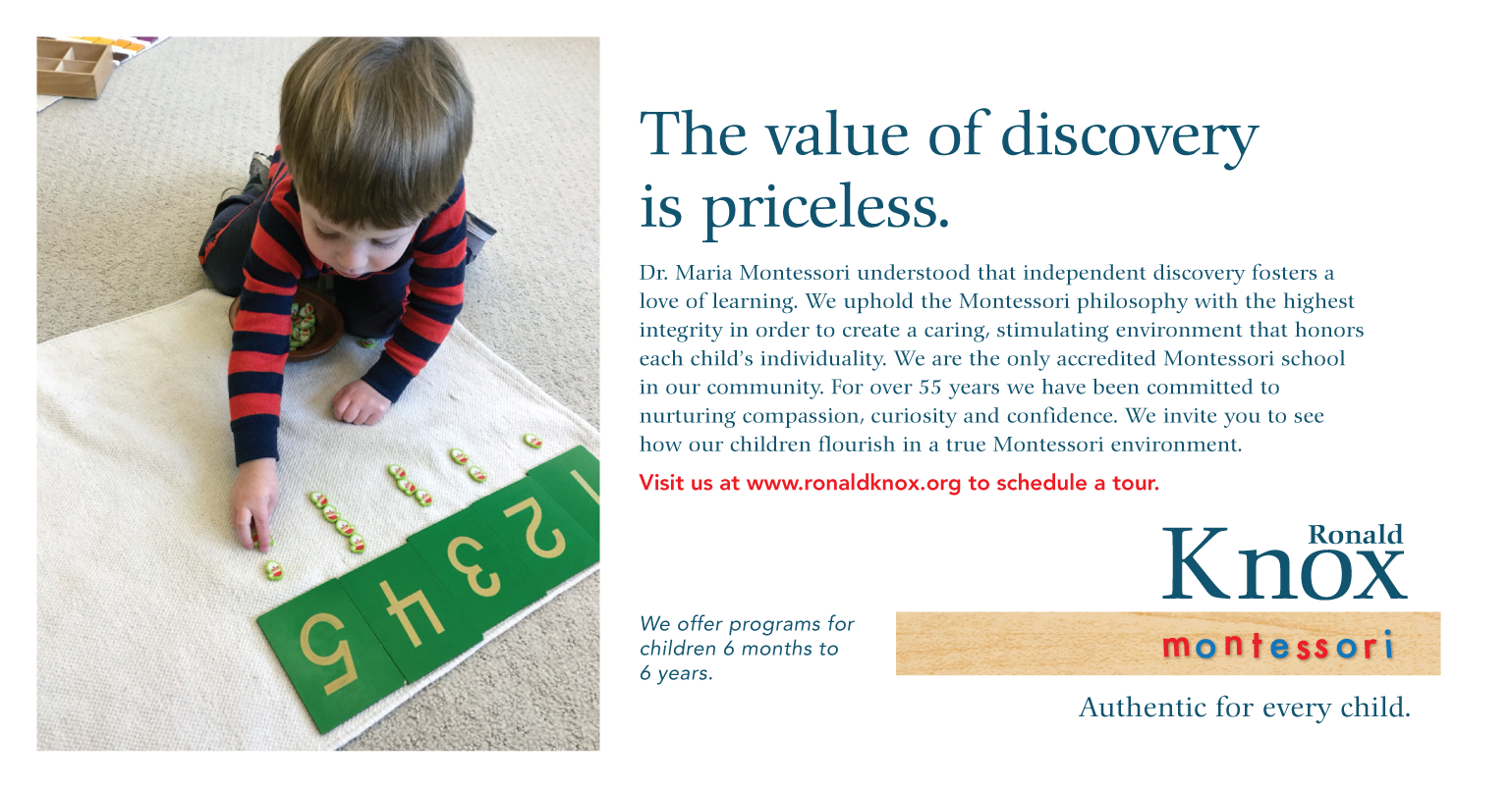
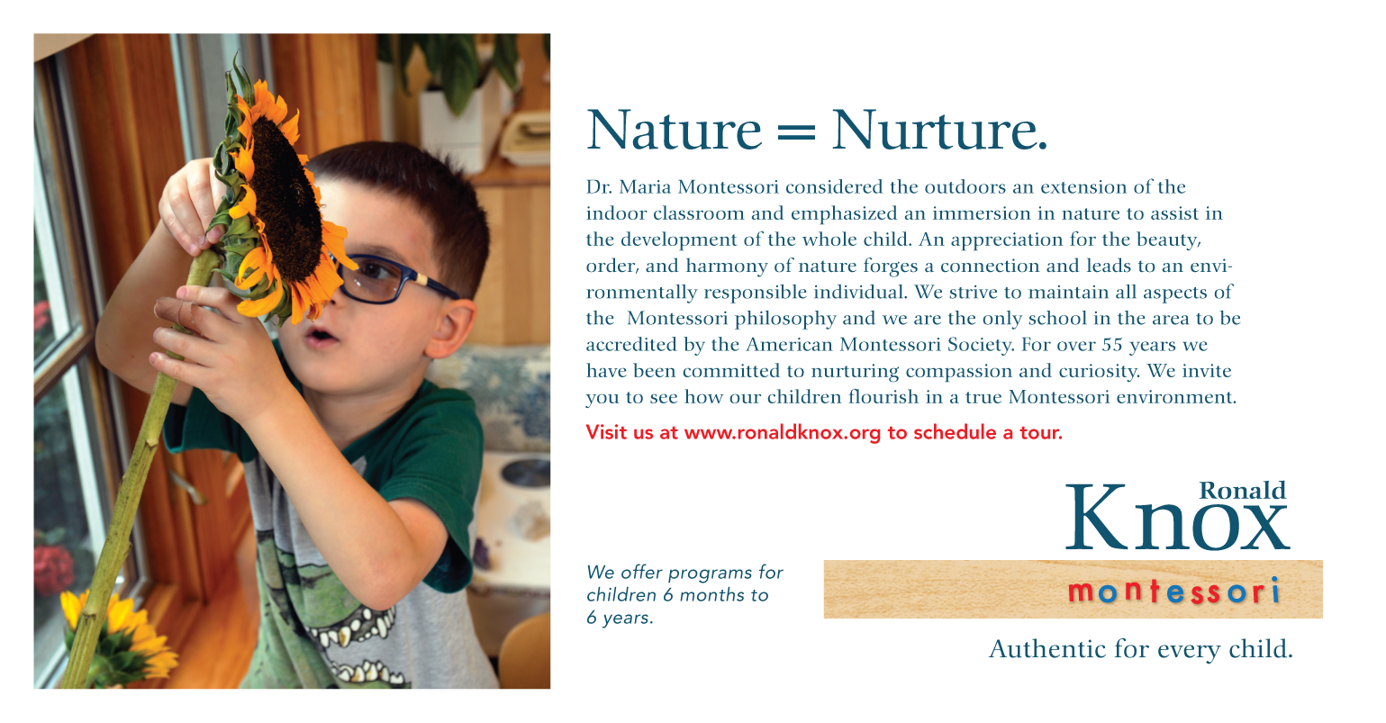
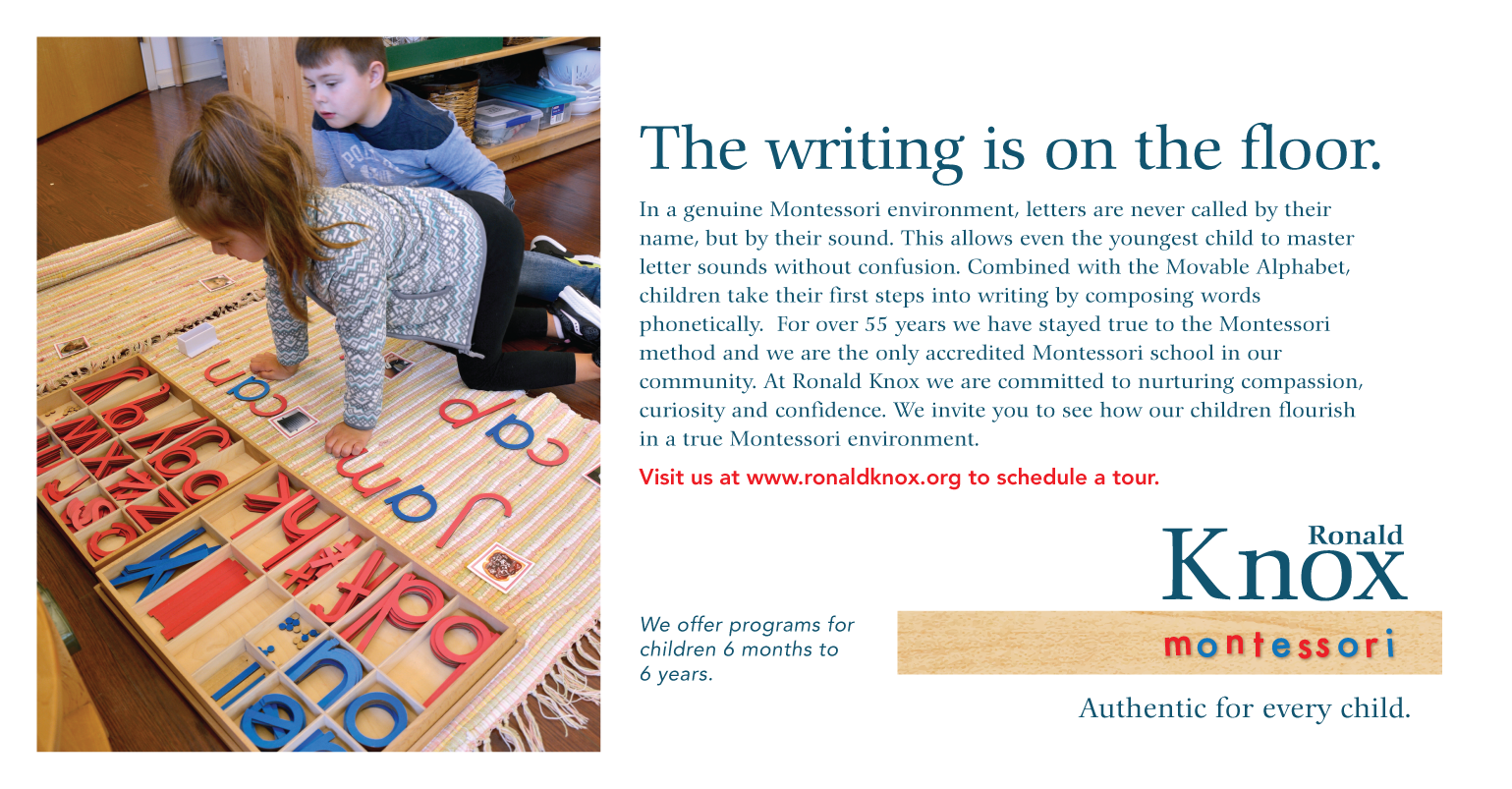
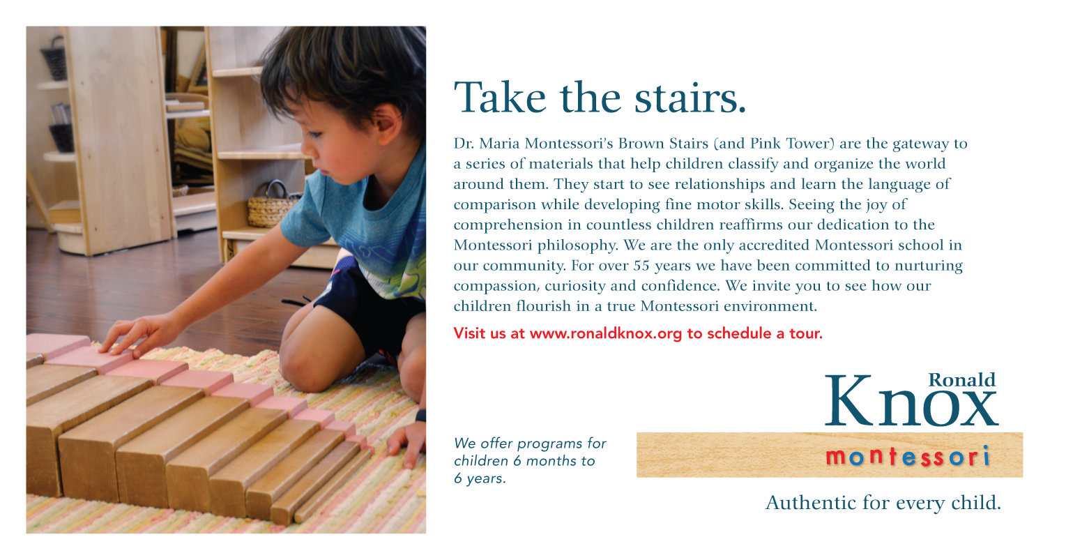
communication Communicating to both current families and prospective ones is a way of reinforcing a brand, or in this case, what a school stands for. Ronald Knox Montessori School has some stiff competition in its community for the preschool and early-education market. What sets it truly apart—but was not well-known— is that it is the only accredited Montessori school in the area. It is a colossal amount of work to be accredited and it means they are genuinely true to the Montessori method. They are authentic and this is the strategy we used, both internally and externally to communicate with the community. Below are some samples of the ad campaign they have running in the local paper |
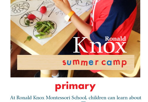
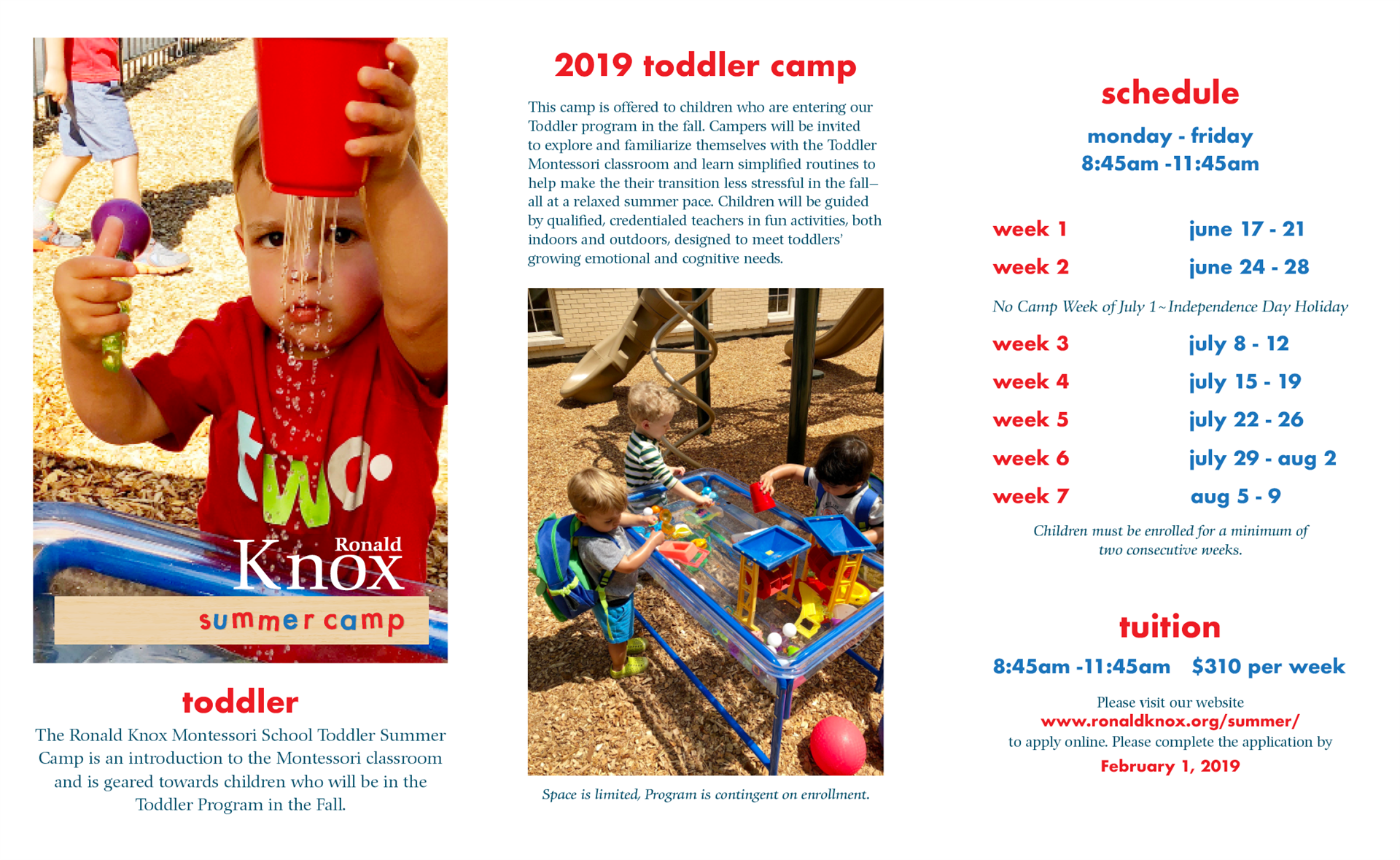
A sample of one of the Ronald Knox Summer Camp brochures, redesigned with the new branding image.
|
| We would be happy to discuss how we may be of service to you and your organization. | +1 (847) 823-1830 |